Case Study - HC Design System
Summary
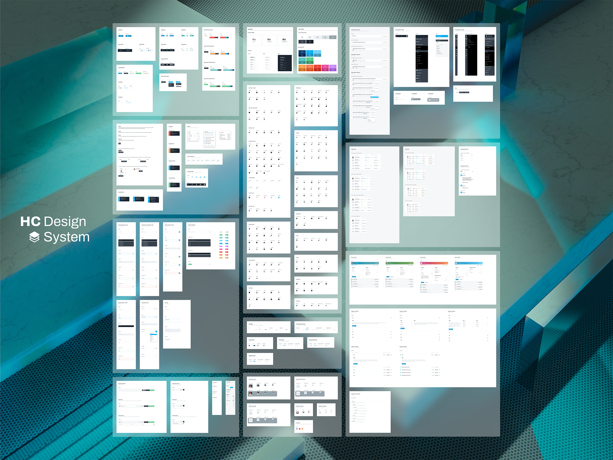
I built and maintained a design library that helped a complex admin platform scale across many modules and teams. The library was a shared set of components, patterns, and rules that kept the product consistent while it grew in surface area, data density, and workflow complexity.
What this case study covers
This is a design library case study first. The workflows are included as proof that the system held up in real product scenarios.
1. Why the library was needed
Early on, the product relied on inherited UI patterns that were good enough to begin building out core features on the back-end. Over time, the platform expanded into many modules and many types of users. As more people contributed to the product, patterns started to duplicate and drift, which increased the risk of mistakes and rework.
The turning point came when the team and product scaled enough that multiple epic sized efforts were running in parallel. At that point, consistency needed to be intentional, both at the micro level and the macro level.
The Product:
Healthy Church was not a small app with a few screens. It was a full admin platform made up of a lot of connected modules. That included people and ministry management (search, records, rosters, groups, and follow ups), content management, reporting and insights, and foundational infrastructure like a data warehouse and third party integrations, including communications tooling. On top of that, the product had builder type tools like a form builder, email builder, and workflow builder. It also supported full event and check in management, including kiosk style screens. With that much surface area, the UI had to work for a lot of different user types and jobs to be done, and it still had to feel like one consistent system.
Tension:
The platform served executives and admins, plus volunteers with low technical confidence. The UI had to stay approachable without sacrificing power user depth.
Constraint:
For a large part of the project, the directive was mobile first. As the platform matured, we kept mobile support strong while recognizing that the heaviest administrative work happened on desktop.
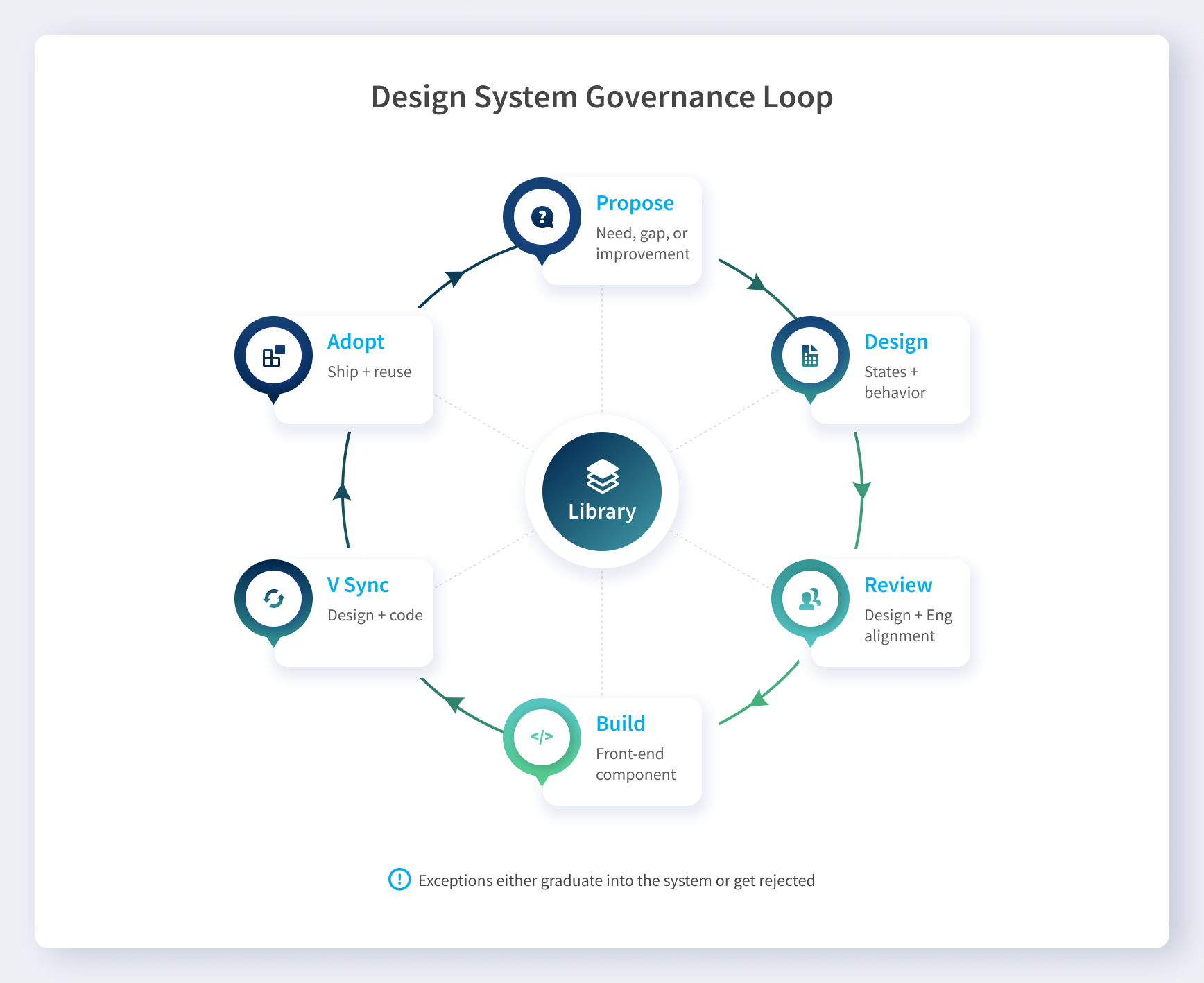
2. My role and system ownership
I started as the primary designer and system owner while also shipping product work. Over time, the library became shared infrastructure used by a team of designers.
- I created the majority of the library and reviewed contributions as patterns matured.
- New components and changes were reviewed with the technical team and front end lead for adoption.
- Design and code versions were kept in sync so the system evolved without drifting.
3. What I built, as a system
The library was designed to remove ambiguity. It turned repeated UI decisions into defaults that teams could trust.
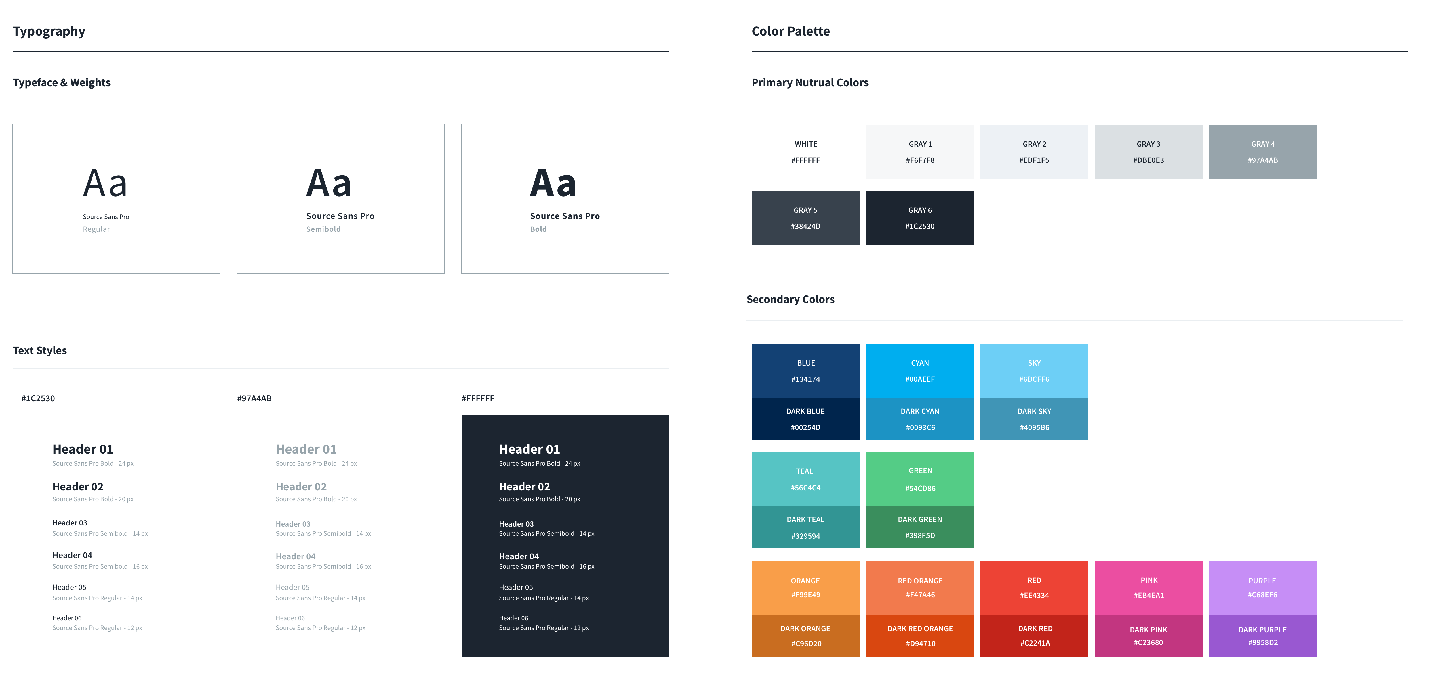
3.1 Foundations
- Typography hierarchy for dense admin surfaces
- Neutral ramp plus semantic colors for meaning and feedback
- Spacing rules that kept layouts consistent across authors
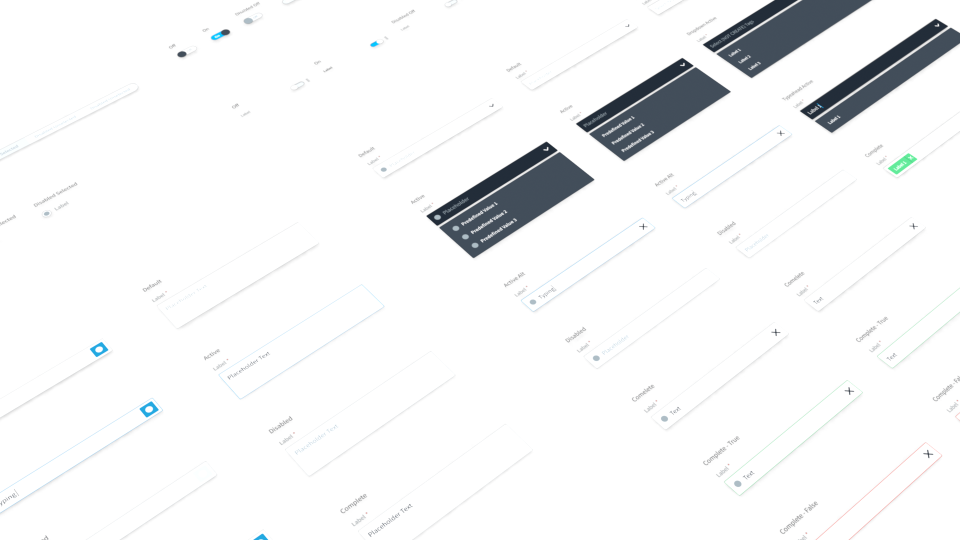
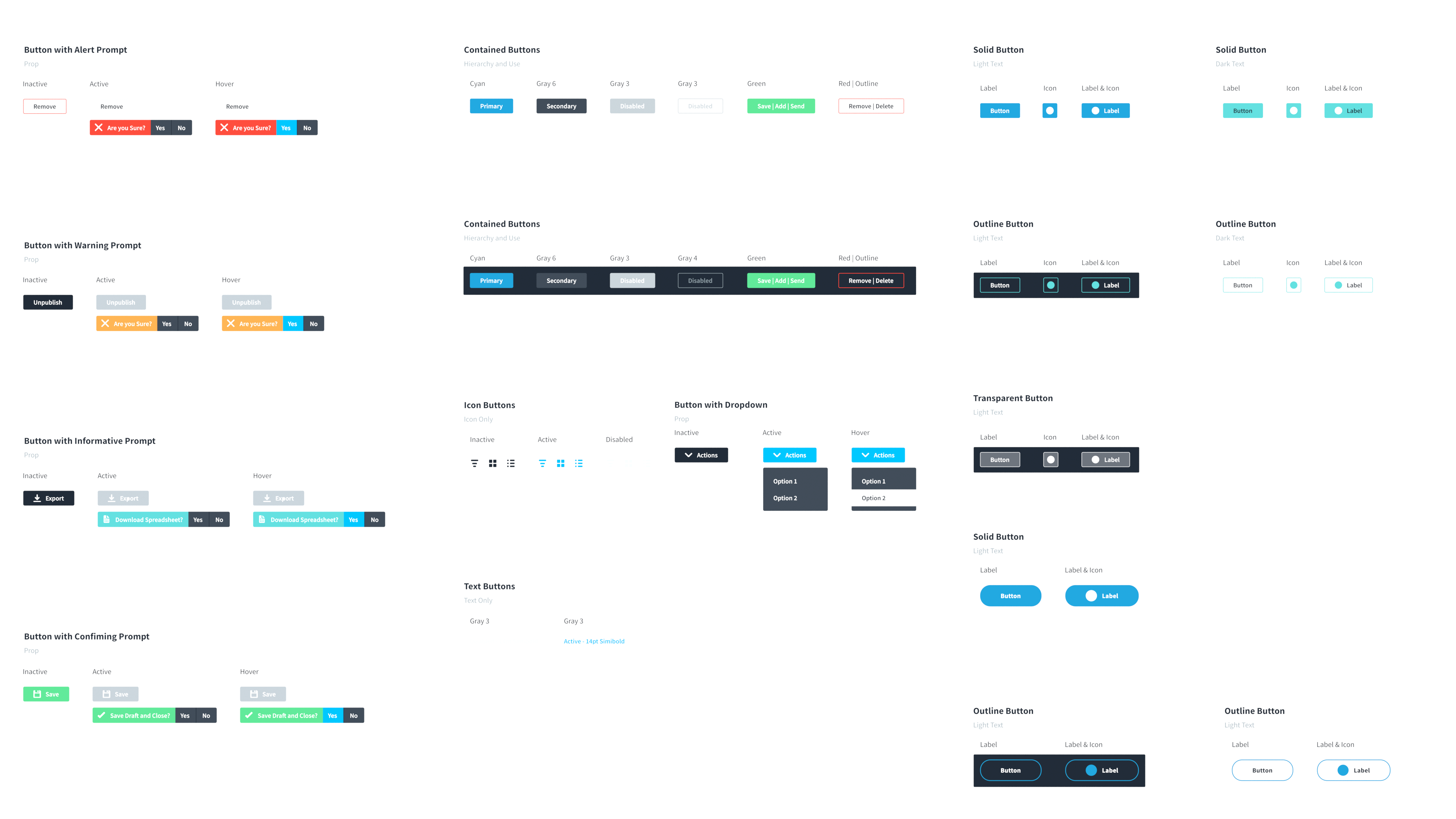
3.2 Component and state coverage
Components were documented with purpose, full state coverage, and interaction notes. The goal was predictable behavior, not just consistent visuals.
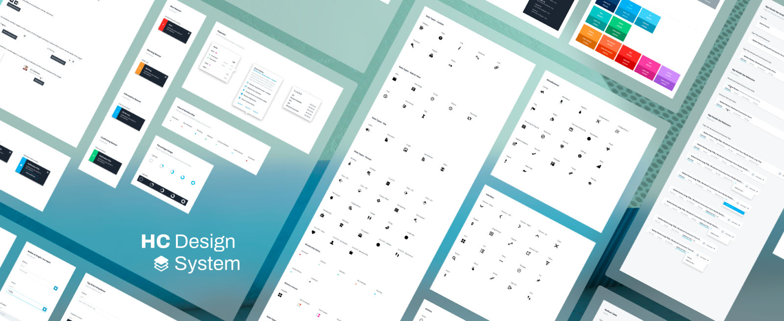
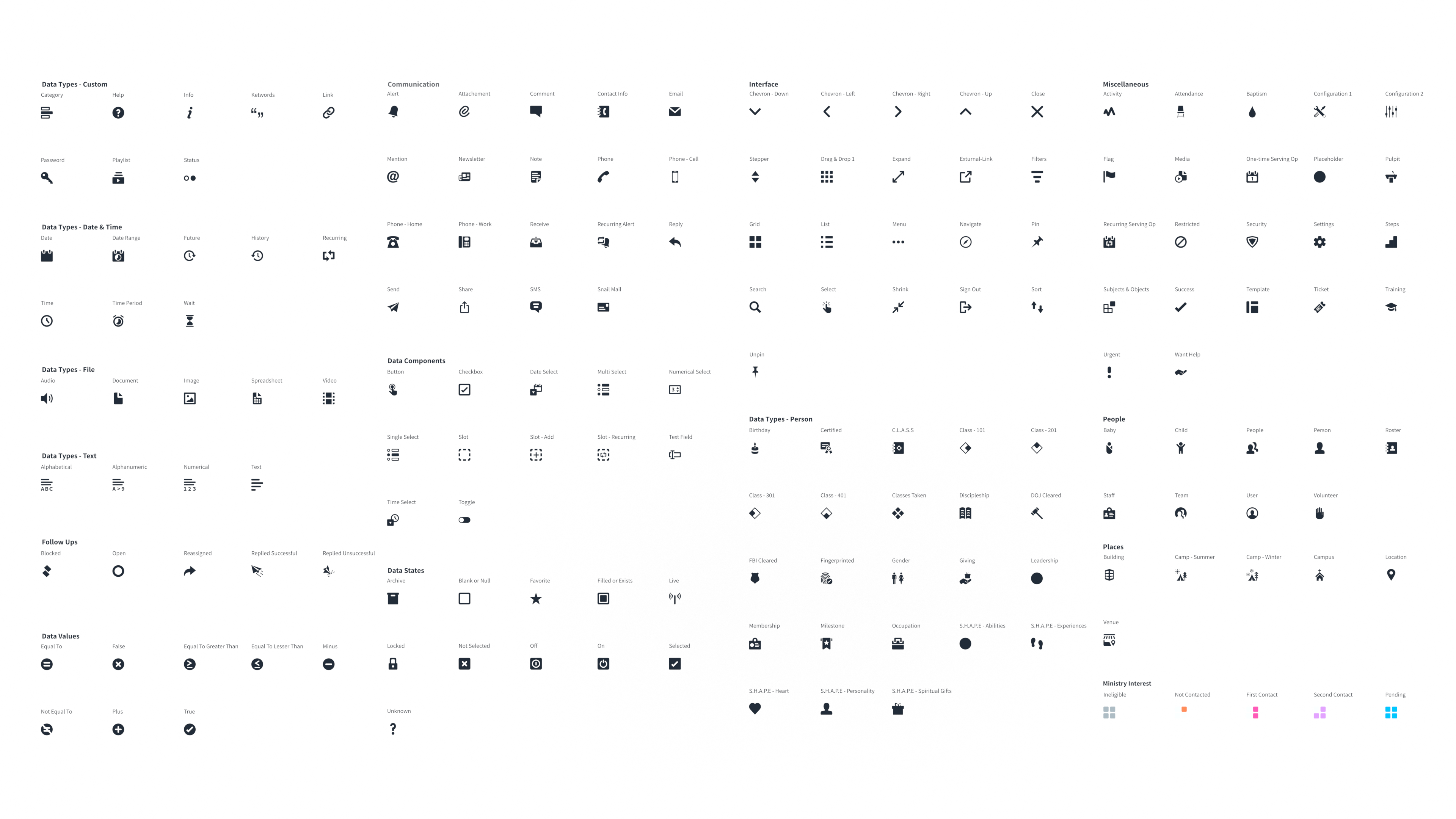
3.3 Icon language
All of the icons were handcrafted and treated as a taxonomy, not decoration. That meant we were building a shared visual language across the product, with icons that had clear meaning and consistent usage rules. The payoff was simple: fewer one off metaphors, less debate, and a UI that stayed coherent even as the platform kept growing into more modules and more workflows.
3.4 Layout and density rules
The system included patterns for tables, rails, headers, and scanning surfaces. Density was treated as a first class requirement, not an edge case.
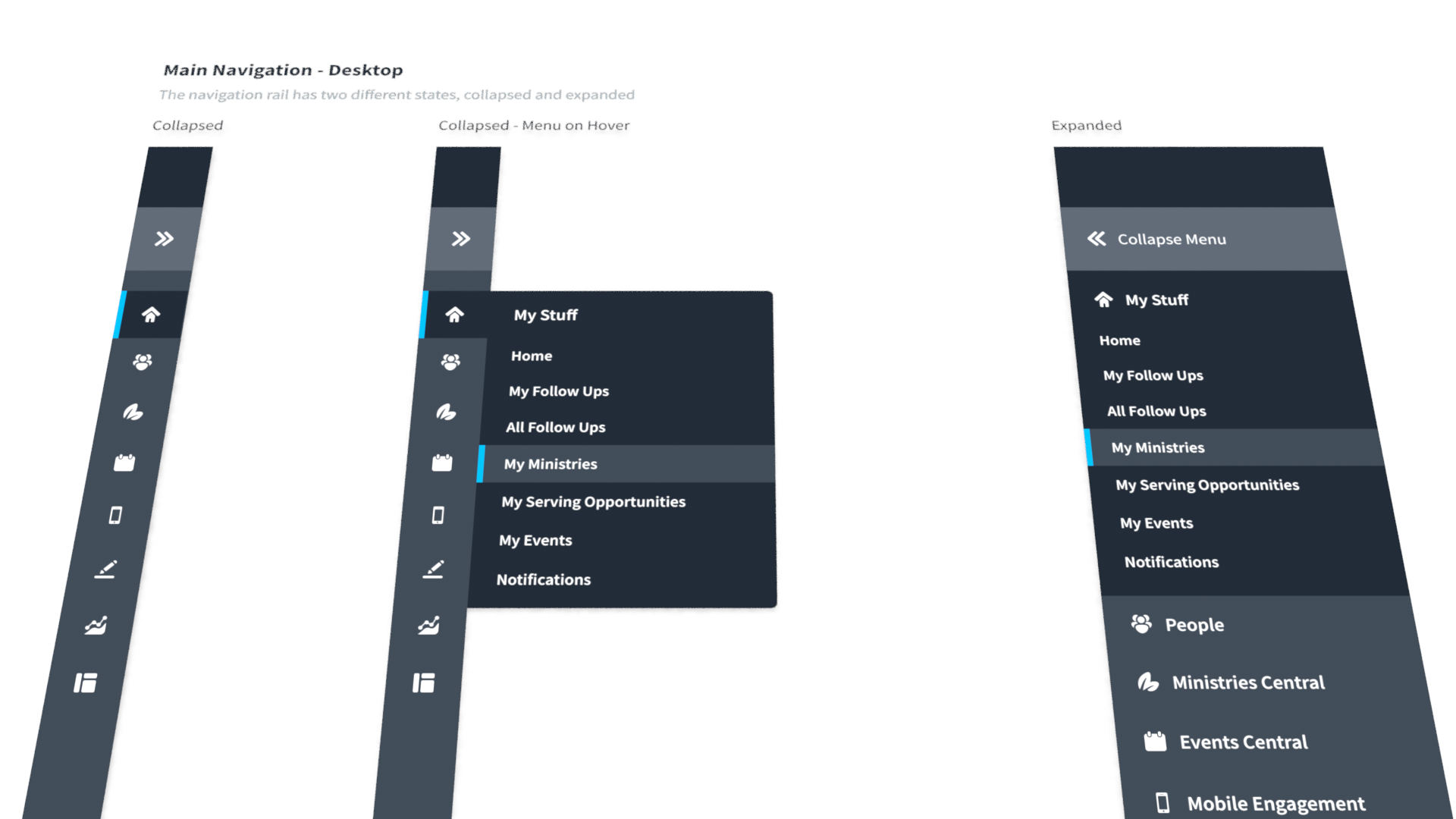
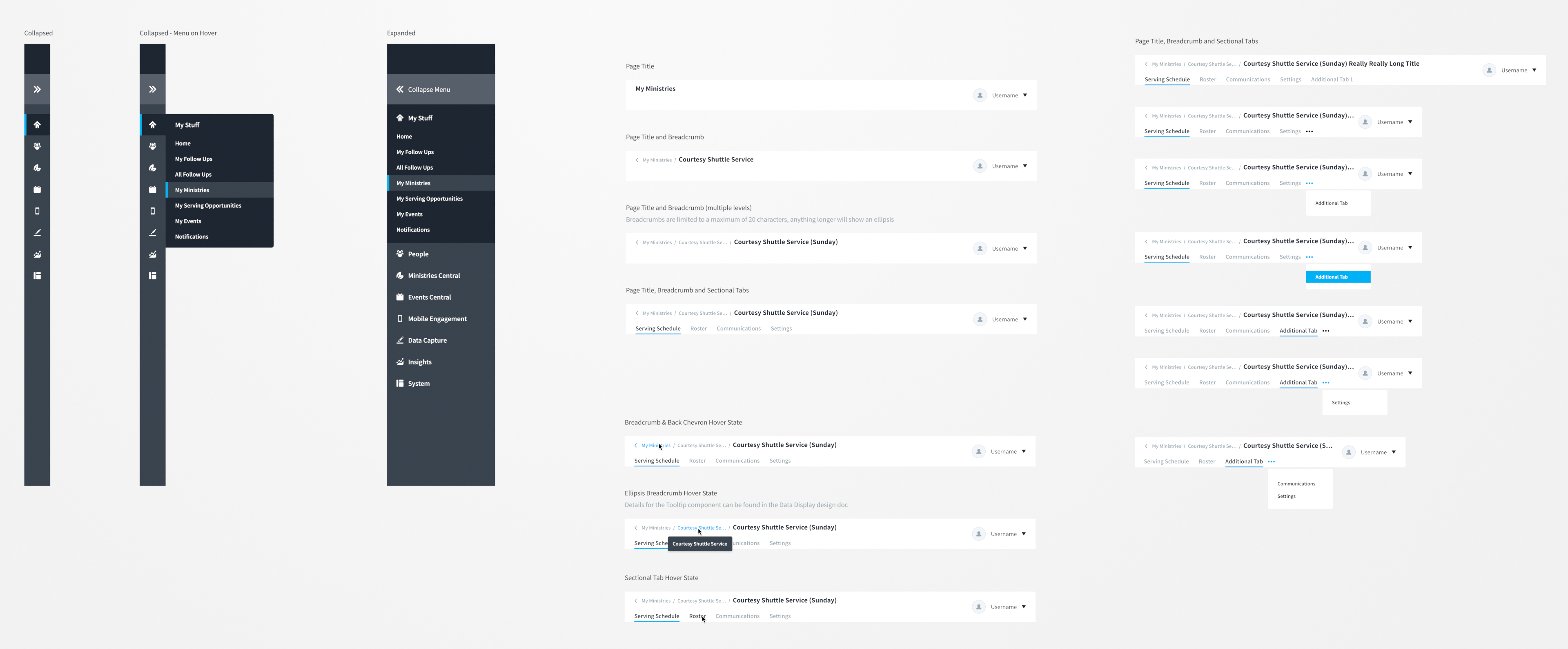
3.5 Navigation patterns
Navigation supported both discoverability and density through clear states and responsive behavior.
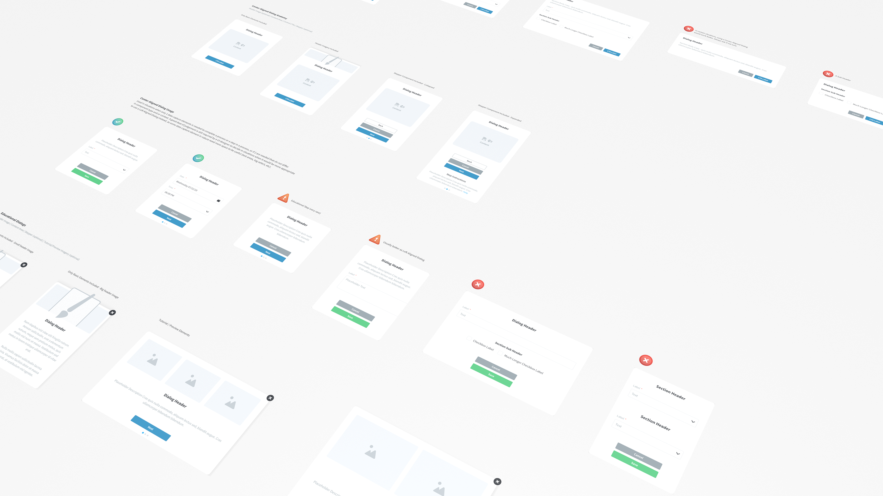
3.6 Workflow containers
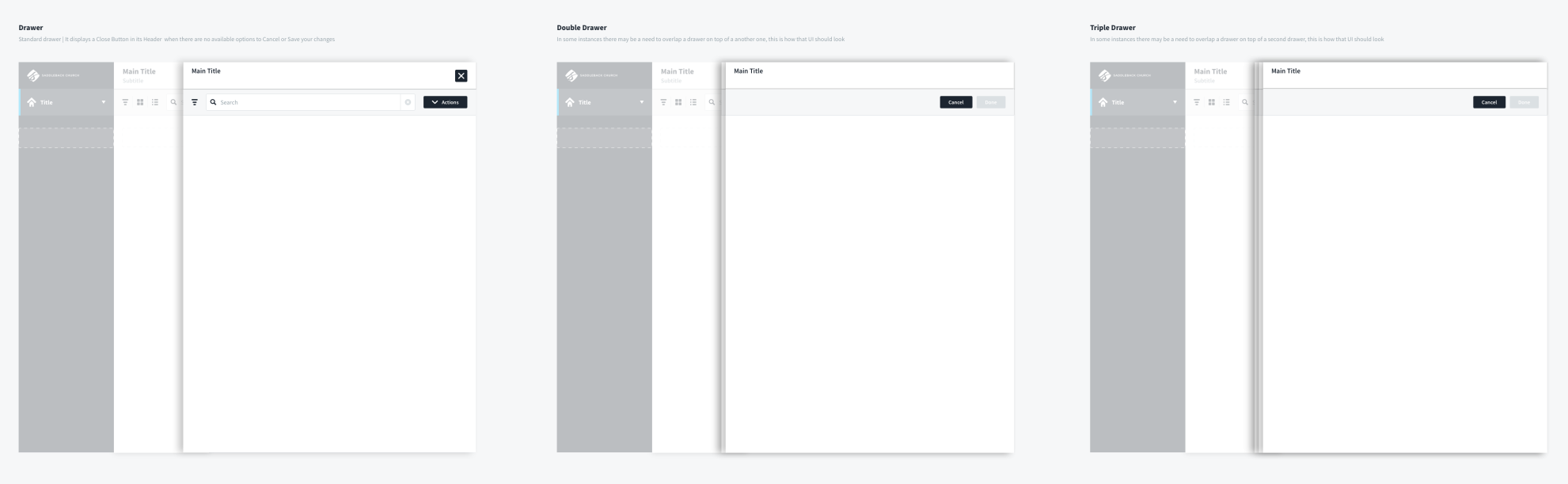
Drawers, modals, and progressive disclosure patterns were documented so deep work could happen without losing context. Drawer stacking had explicit limits to keep users oriented.
4. Library in practice, three stress tests
These examples show the library working as a set of rules and patterns, not as isolated screens.
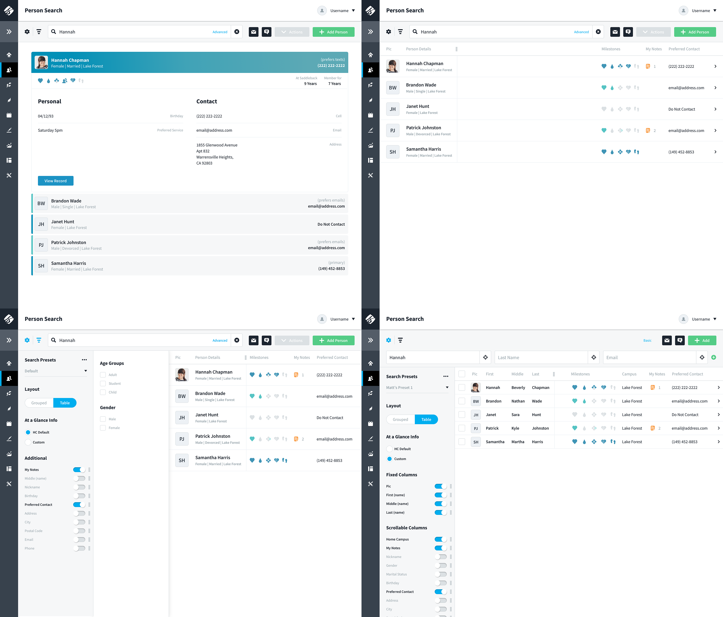
Stress Test 1: Person Search
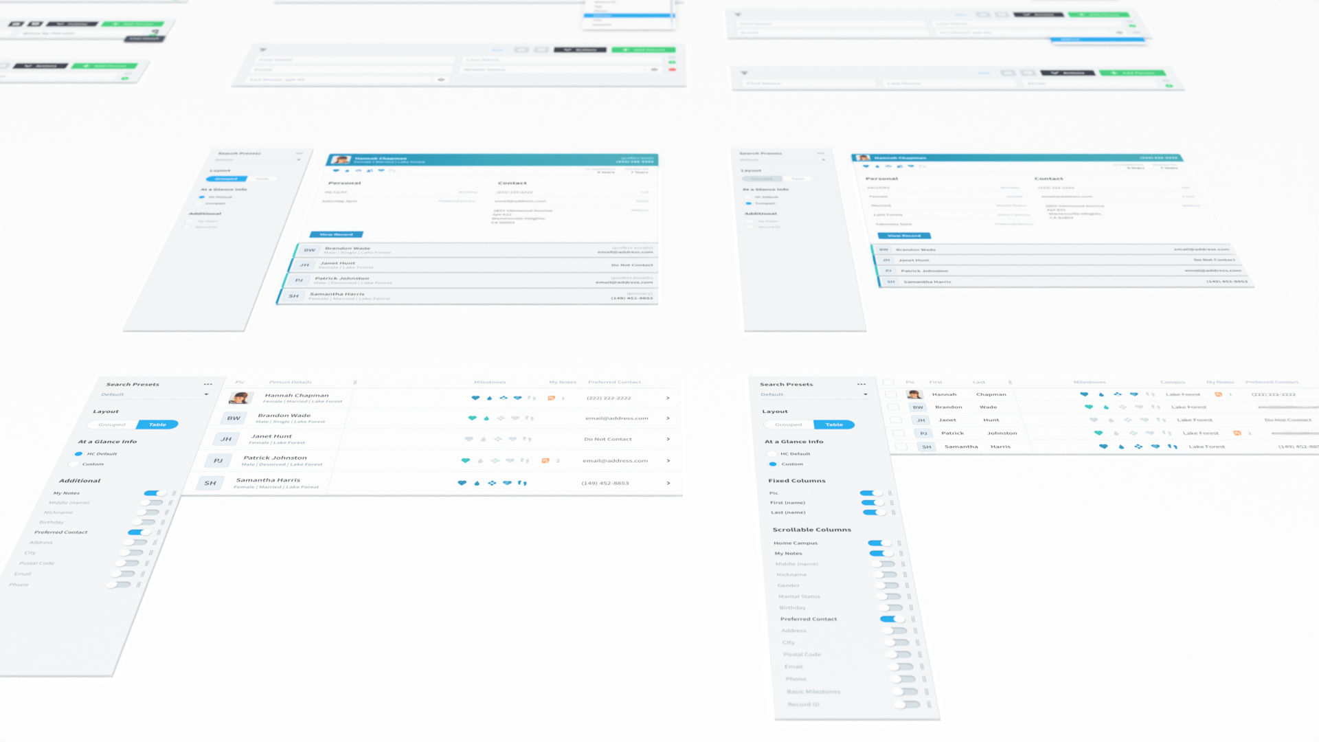
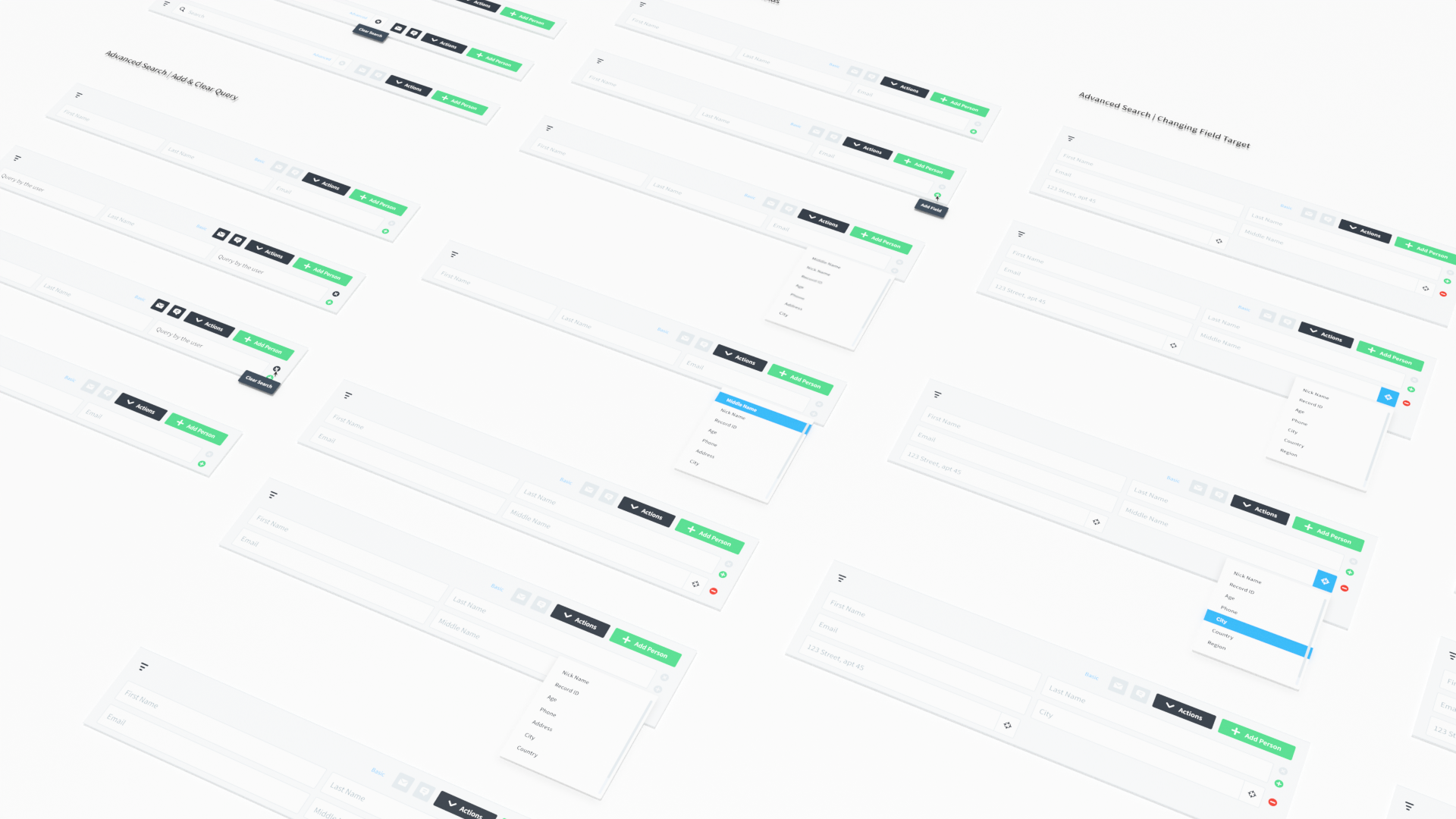
Person search was basically the front door to the whole platform. It had to work for quick tasks like check in and roster lookups, but it also had to hold up for heavy admin work like data cleanup and duplicate management. The way we kept it from turning into a mess was by being really strict about the control model. The actions bar stayed the command center, the filters rail stayed focused on shaping the dataset, and the settings rail stayed focused on how results were displayed. Once that structure was locked in, we could layer on power user flexibility like advanced search building and saved presets without breaking the experience. And because the same pattern worked on full pages and inside drawers, the behavior felt consistent no matter where someone was in the app.
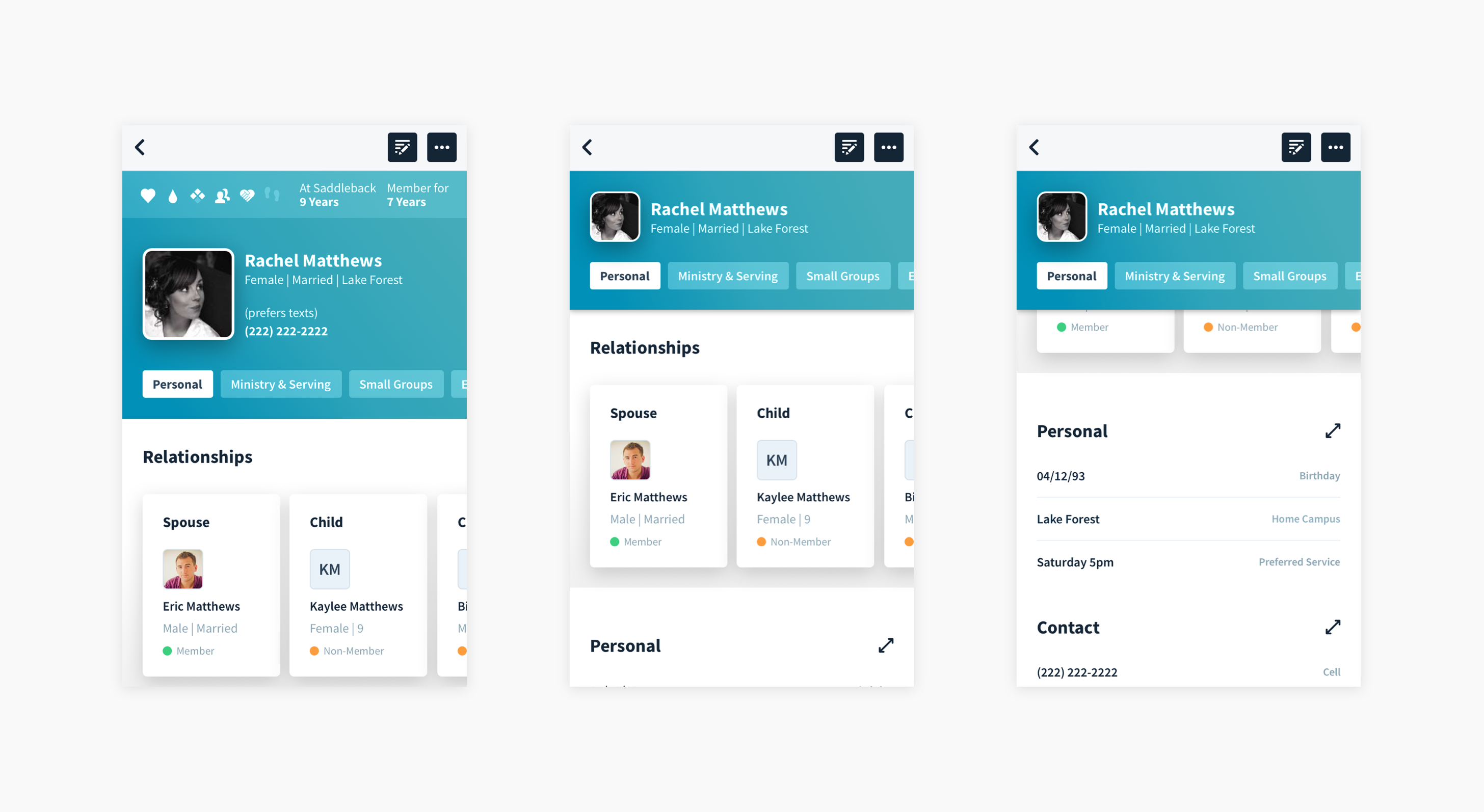
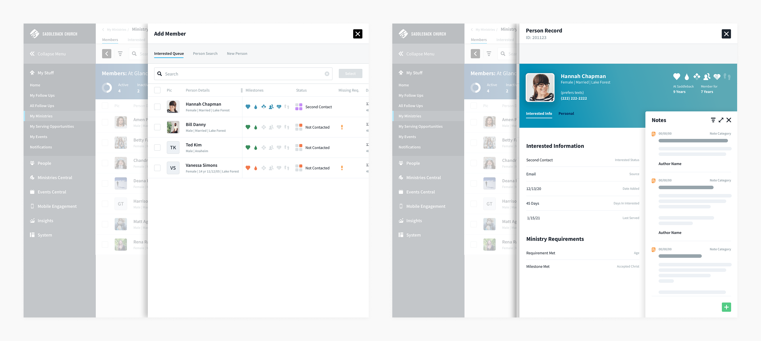
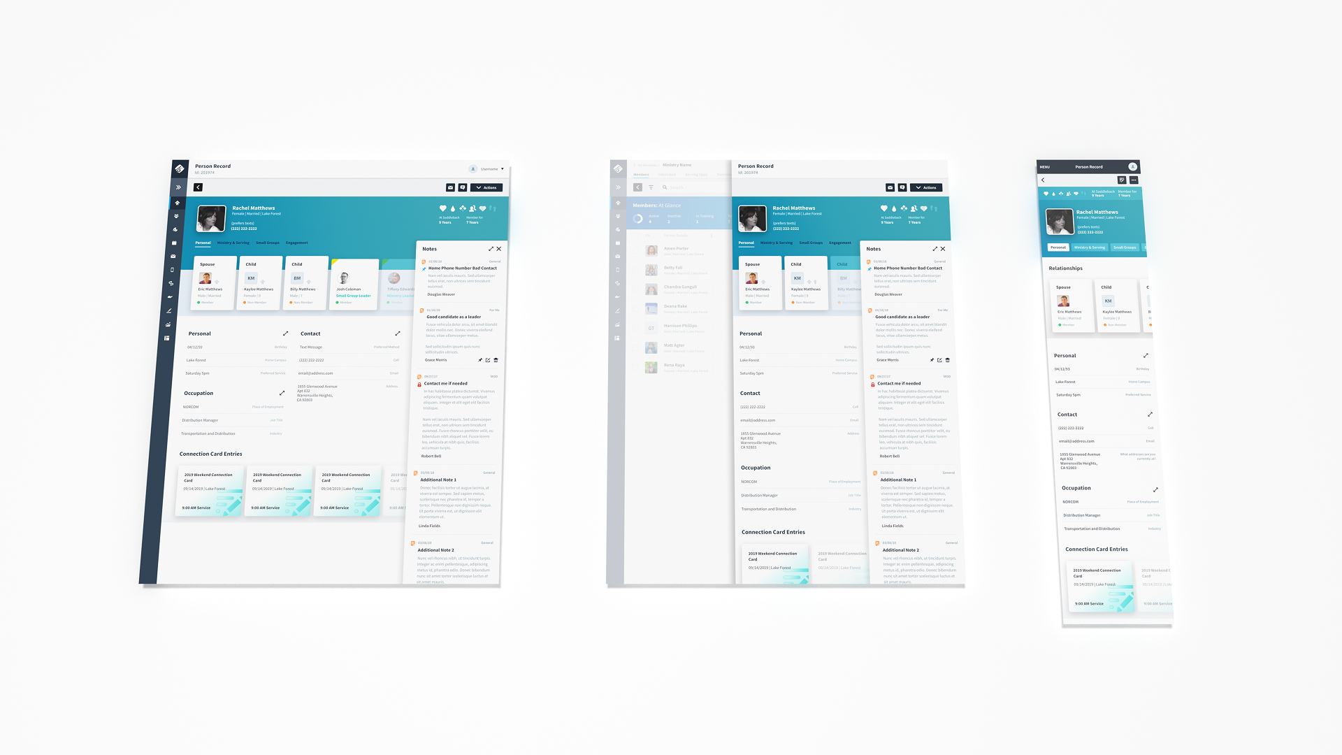
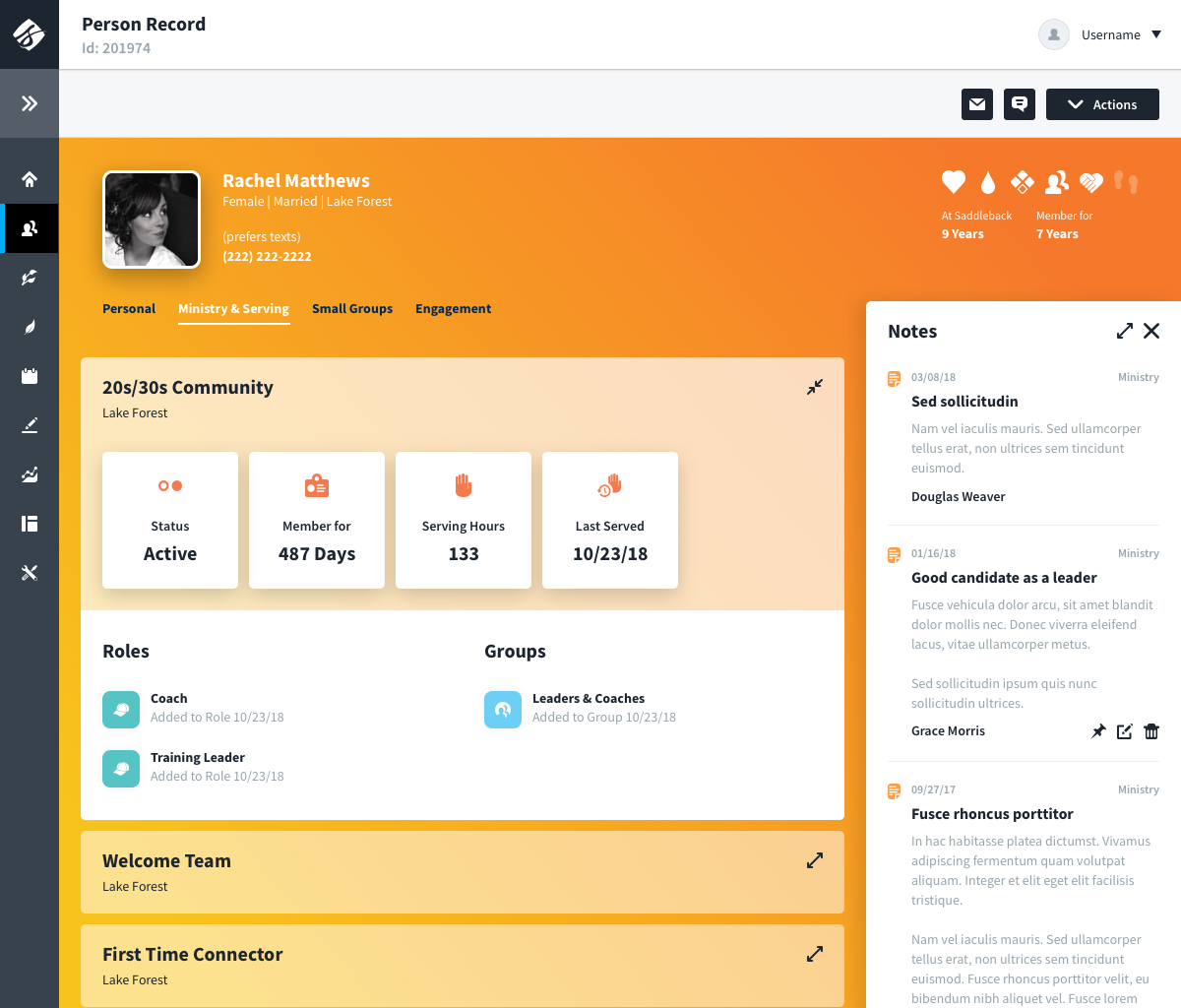
Stress Test 2: Person Record
The person record was the main place where the product had to prove it could handle real world people data without falling apart. It was designed to be dense, but still scannable. It had to support quick at a glance understanding at the top, and deep work further down, without turning into a wall of fields.
It also set the standard for how person data showed up everywhere else in the app. Once this layout and hierarchy were locked in, other screens could reuse the same grouping and patterns. That meant users learned where to look once, and then could move faster everywhere.
A few things made it work:
- Fully responsive: the same person record scaled all the way down to mobile without becoming a separate product.
- Density with structure: the record used consistent sections, predictable grouping, and clear scan paths so high volume data still felt organized.
- Progressive disclosure: condensed and expanded states kept the important stuff visible while letting the rest stay out of the way until you needed it.
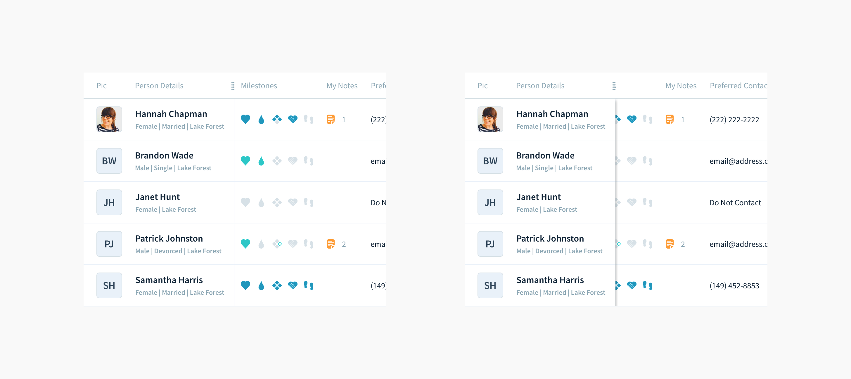
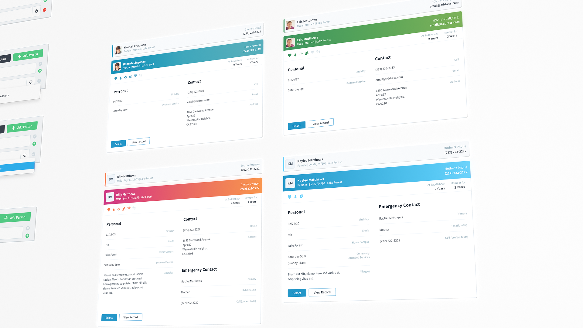
Stress Test 3: Person Accordion Results
Before the redesign, person search was powerful but hard to use and trust. Few people knew how to build advanced queries (syntax, field targeting, wildcards), but the results rarely made it obvious why someone showed up. That slowed people down, especially when confirming identity fast (similar names, families, students) without opening a full record.
The accordion fixed that without turning the list into a wall of fields:
- Collapsed row: the key identity info most people need (photo, name, gender, primary contact, campus, age and grade for minors).
- Expanded preview: the same grouping you see at the top of the person record, so scan patterns stayed consistent across the system.
- Shared structure: the body reused the Data Group component, which made variants easy (like a student version with emergency contact).
- People-first defaults: record ID was hidden by default, but could be turned on when needed for data integrity workflows.
5. Outcomes
The outcomes were not abstract. The library made day to day work faster and more straight forward. Once the rules were in place, the team could spend less energy on alignment and more energy on the actual workflows.
- Onboarding got faster because patterns and rules were explicit.
- Consistency and accuracy improved as the product stopped drifting.
- Teams spent less time debating preferences and more time solving workflow problems.
6. Reflection
The biggest takeaway for me was that the hard part is not designing components, it is designing the decision making behind them. The library only held up because it came with clear rules for behavior, hierarchy, and responsiveness, and those rules stayed consistent even as the product and team scaled.
- Consistency is a UX feature and a coordination tool.
- Constraints are what make flexibility usable.
- The highest leverage design system work is the interaction model and layout rules.